Building off of my last post, after several setbacks over 3 days, I finally managed to hack together a function that generates the RPI and heat limited pace related plots of my previous posts all from the comfort of a RStudio chunk.
First off, for the life of me I couldn’t figure out how to run a Python script from within R using the reticulate package. I spent hours to get this to work. I learned a hard lesson. That is, to make sure my Python working directory from within RStudio is correct! I should have known. When the Python script messages were printing without any .fit files getting converted to .csv, I should have known that the Python script was working and that there were simply no .fit files to process because I was running the script from the wrong path!1
After getting pack on path (😉), I designed the function so I no longer had to manually figure out .fit filenames from searching the SQLite datatbase of activities, locate and copy .fit files to a working directory, manually run the Python script to convert from .fit to .csv, post-process the data for plotting, then point my R code to the files.
One set of helper functions2 focuses getting the requested raw running activity data from the Garmin Connect website to my computer so that it can be post-processed in R. The second set3 focuses on the creation and formatting of the main R dataframe used for plotting after the requested data is made available. The third incorporates the previous 2 sets of helper functions and creates a single unifying wrapper function.4
Hua Hin late Spring 2020 runnning data.
All I really have to do now is figure out at least a partial activity name to pass to RPIandHeatLimitedPacePlots.R.
As before, I still have to manually provide humidity data for the run, but at least this is the only manual step remaining.
# Update Garmin activity database
# system("cp /Applications/GarminDb_Darwin_1.6.0/GarminConnectConfig.json . && /Applications/GarminDb_Darwin_1.6.0/download_update_dbs.sh")

source("~/GitHub/myBlog/content/resources/2020-06-14-heat-training-continues-in-hua-hin/RPIandHeatLimitedPacePlots.R")

# Pran Buri Running

dataPB <- getRPIandHLPfromFIT(wd = "~/HealthData/FitFiles/working/", aname = "Pran Buri")
cleanup()

# Fix run split over 2 different dates.
dataPB$Date <- as.character(dataPB$Date)
dataPB <- dataPB %>% mutate(Date = ifelse(Date == "2020-06-17", "2020-06-18", Date))
dataPB$Date <- as.Date(dataPB$Date)

# Hua Hin Running

dataHH <- getRPIandHLPfromFIT(wd = "~/HealthData/FitFiles/working/", aname = "Hua Hin")
cleanup()

dataHuaHin <- bind_rows(dataPB, dataHH)

########### OPTIONAL USER INPUT FOR HEAT INDEX FACET

humidity  <-
  tribble(
    ~Date,  ~humidity,
    "2020-06-09", 79,
    "2020-06-13", 62,
    "2020-06-17", 76,
    "2020-06-18", 76,
    "2020-06-21", 70,
    "2020-06-25", 68
)

#####################

dataHuaHin <- addHI(dataHuaHin, humidity)

plotViolation(dataHuaHin, titleText = "Hua Hin Running late Spring 2020 runs.")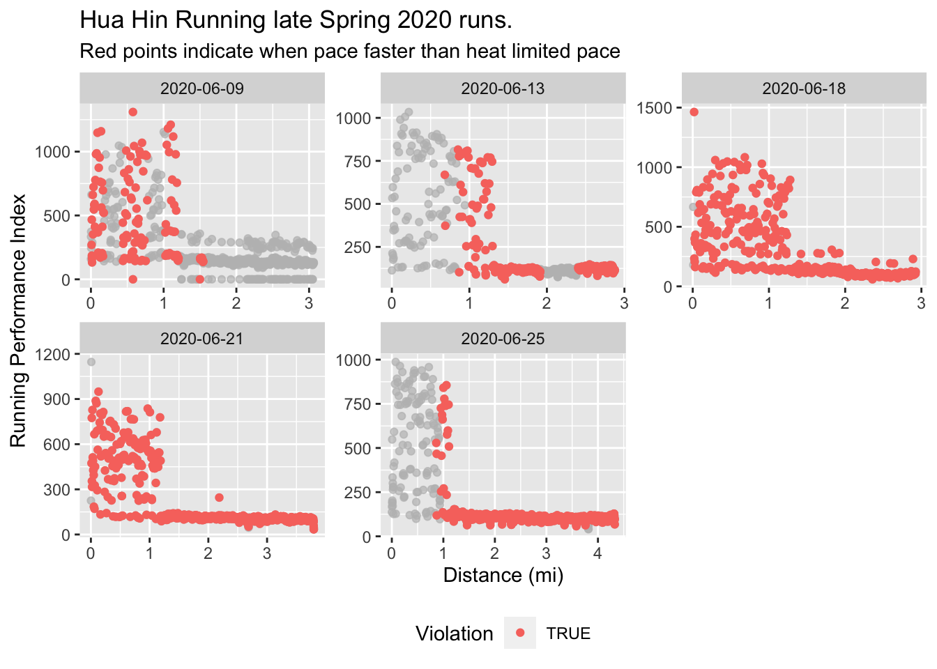
plotViolationSumm(dataHuaHin, titleText = "Hua Hin Running late Spring 2020 runs.")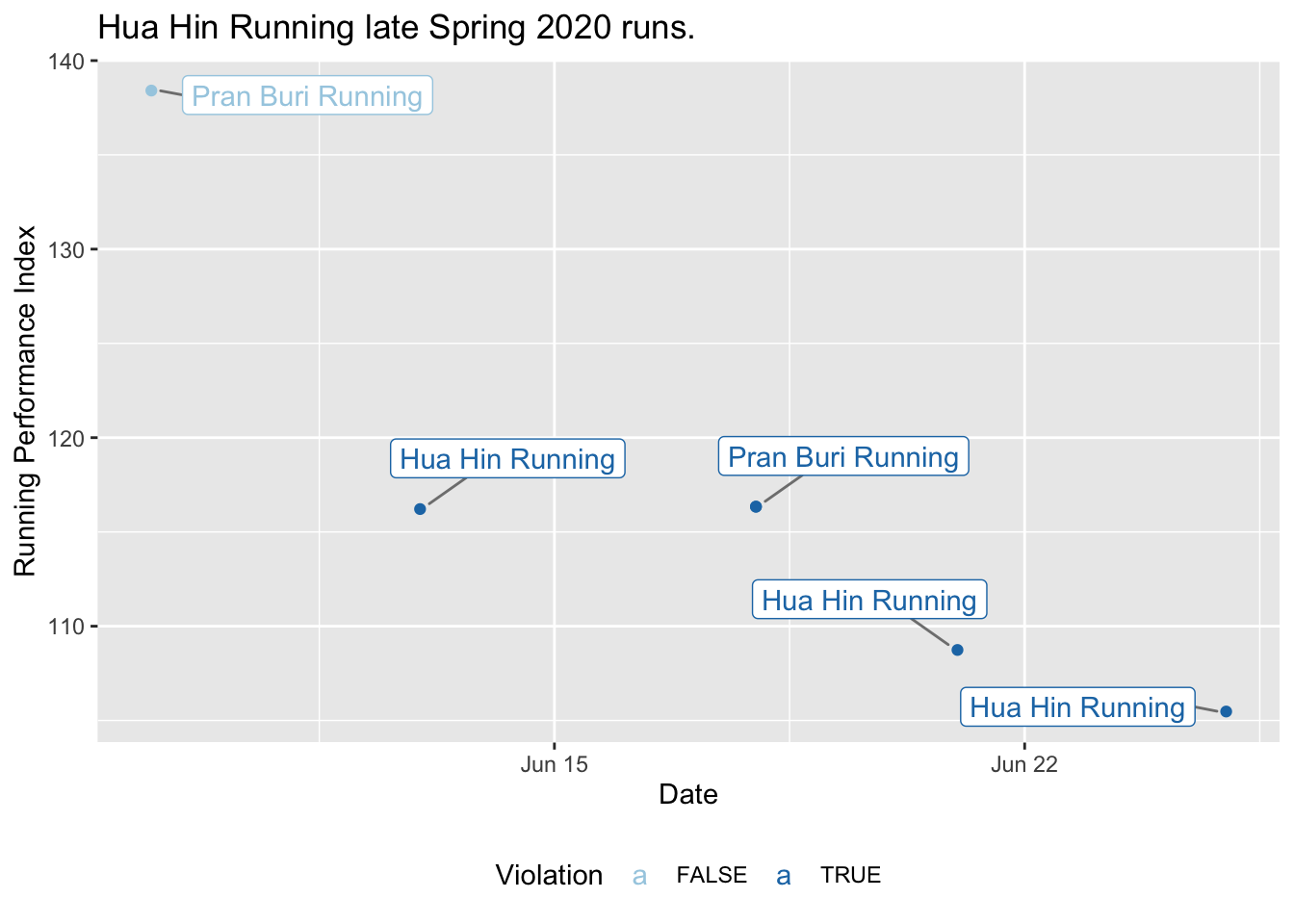
plotRPI(dataHuaHin, titleText = "Hua Hin Running late Spring 2020 runs.")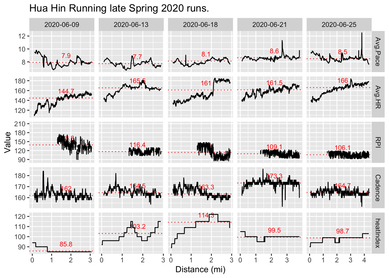
A few things I found interesting, thoughts, and notes on some plot features:
- The spikes in 2020-06-13 heat index correspond to the last part of a lap for this course, which was around a nearby lake. I remember this stretch not being in shade like most of the run and uncomfortably hot (as the data supports).5
Function removes first 1.3 mi of RPI data due to noise. Likely best to compare runs of about the same distance (and other characteristics) for most meaningful average RPI comparisons. Also, runs < 3 mi should not be analyzed as these really short runs don’t allow enough time to assess a meaningful average RPI.
Function trims first 0.1 mi of other data due to inaccurate measurements.
Heat index may have a significant effect on RPI in this case as seen through elevated HR for approximately the same pace as the 2020-06-09 run with other similar characteristcs. Although, this is counter to the conclusions of my previous post on the relationship between heat limited pace and RPI.
Based on observed and unfiltered noise, are previous RPI calculations accurate? Excess noise may have to due with errors in distance estimation early on in run due to very small distance between 1s measurement intervals. Check GPS accuracy.
Re-analyze .fit data from Pike’s Peek 10k PR and compare with value in Running economy over time post. plot.6
Pike’s Peek 2018 race data.
Regarding that last note, here is my Pike’s Peek 10k PR data.
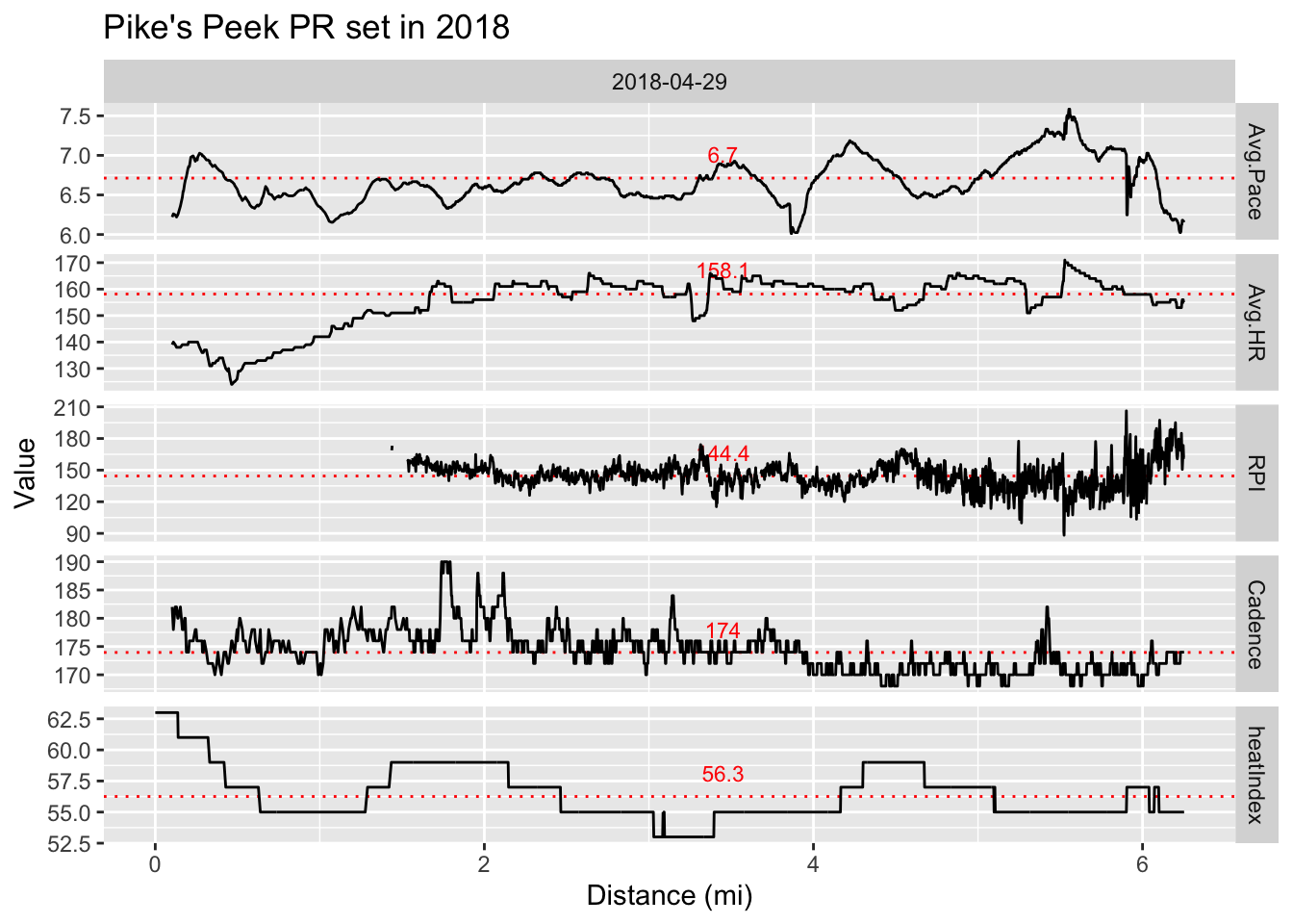
There is a difference between the RPI generated from the filtered .fit data shown here (144.4) and that from the activity level data as seen in the final plot of my previous Running economy over time. post (158.1).
If I don’t filter the RPI data for distances greater than 1.3 miles, the RPI goes up to about 185. So, the RPI from the activity level data is probably due to it being based on the average pace and heart rate for the entire run, which may actually provide the best estimate for RPI as it is simple, requiring only 2 numbers and no filtering for the calculation. However, it is likely biased a bit high because none of the low heart rate data that occurs at the beginning of the run due to starting at rest is filtered out.
Nonetheless, I am excited at my progress and happy to have a convenient function for analyzing and comparing future running data to answer all the random questions that occur to me.