Plot heat limited running pace and a sample of my average running pace data vs. temperature and humidity.
I obtained heat limiting pace data from fellrnr.com to see if my body would naturally self-limit pace based on intense heat.
I wanted to spot check some of my running data taken during pretty intense heat in Bangkok while I was there during late Spring 2020. I was specifically looking for running performance dips in more extreme cases.
First I wanted to identify points that fall below those in the 3D scatterplot below, which would indicate that I ran faster than what is recommeded for my body to prevent heat exhaustion.
I can make out that several points are straddling the limit, but it is difficult to visualize.
In an attempt to present the data on a 2D plot so it’s easier to see, let’s transform the temperature and relative humidity variables into a single heat index variable (i.e., one that depends on both temperature and humidity).
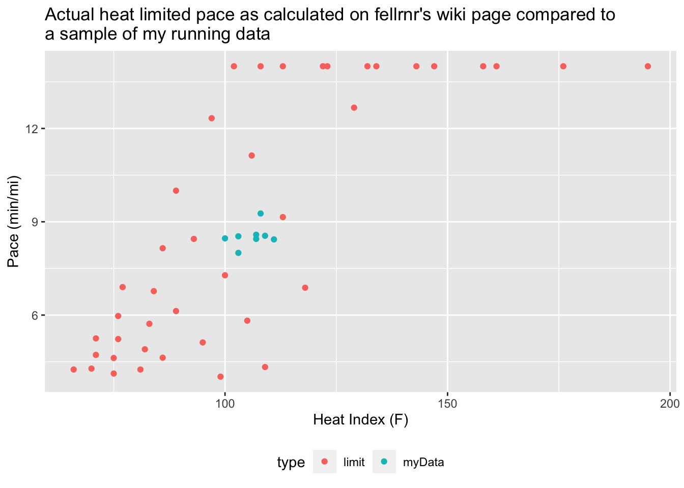
Unfortunately, this particular 2D plot doesn’t make it any easier to see how the running data compares to a heat limited pace line (or line projections in this case).
Let’s group the data based on relative humidity, which should mostly solve our visualization problem. We can use one of my favorite functions – cut2 – from the Hmisc library. All we have to do is specify the relative humidity cut points for plotting.
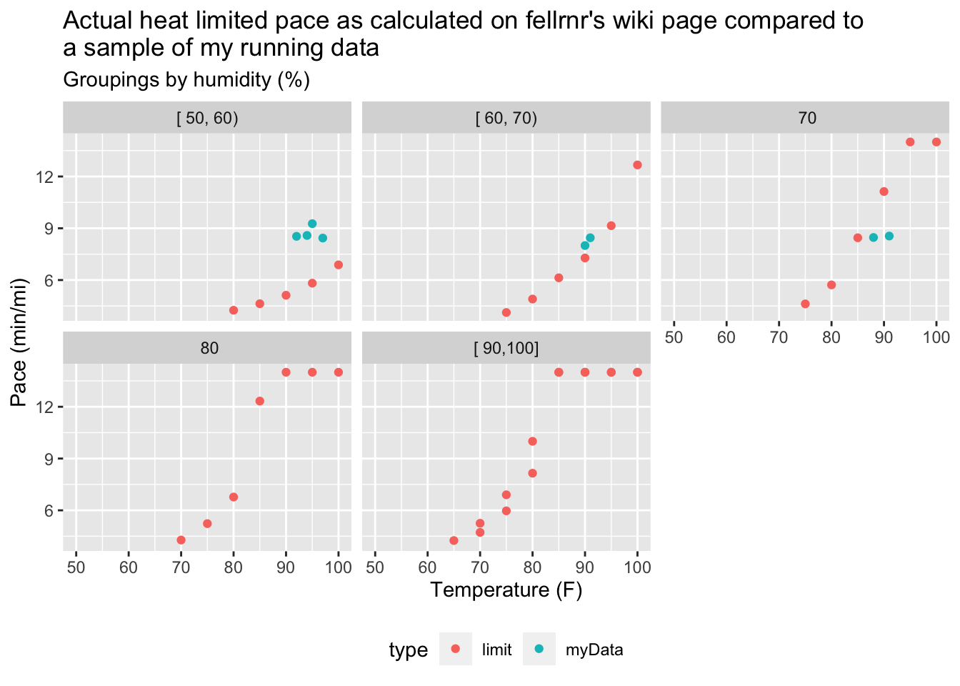
This looks much better. Now the data is displayed clearly and we can quickly confirm at least 2 observations that just barely violate the recommended heat limited pace guideline in the 70% relative humidity subplot (and maybe a couple in the 60%-70% subplot).
After we create and validate a continuous heat limited pace model, we can try and see if running performance for the “violations” were significantly different from other runs.
Creating and validating a continuous heat limited pace model.
Using a trial and error approach, I first created various multvariate regression models based on the few (temperature, humidity, pace) data points from the fellrnr heat limited pace wiki mentioned earlier to see if I could come up with a continuous analytical formula for heat limited running pace as a function of temperature and humidity.
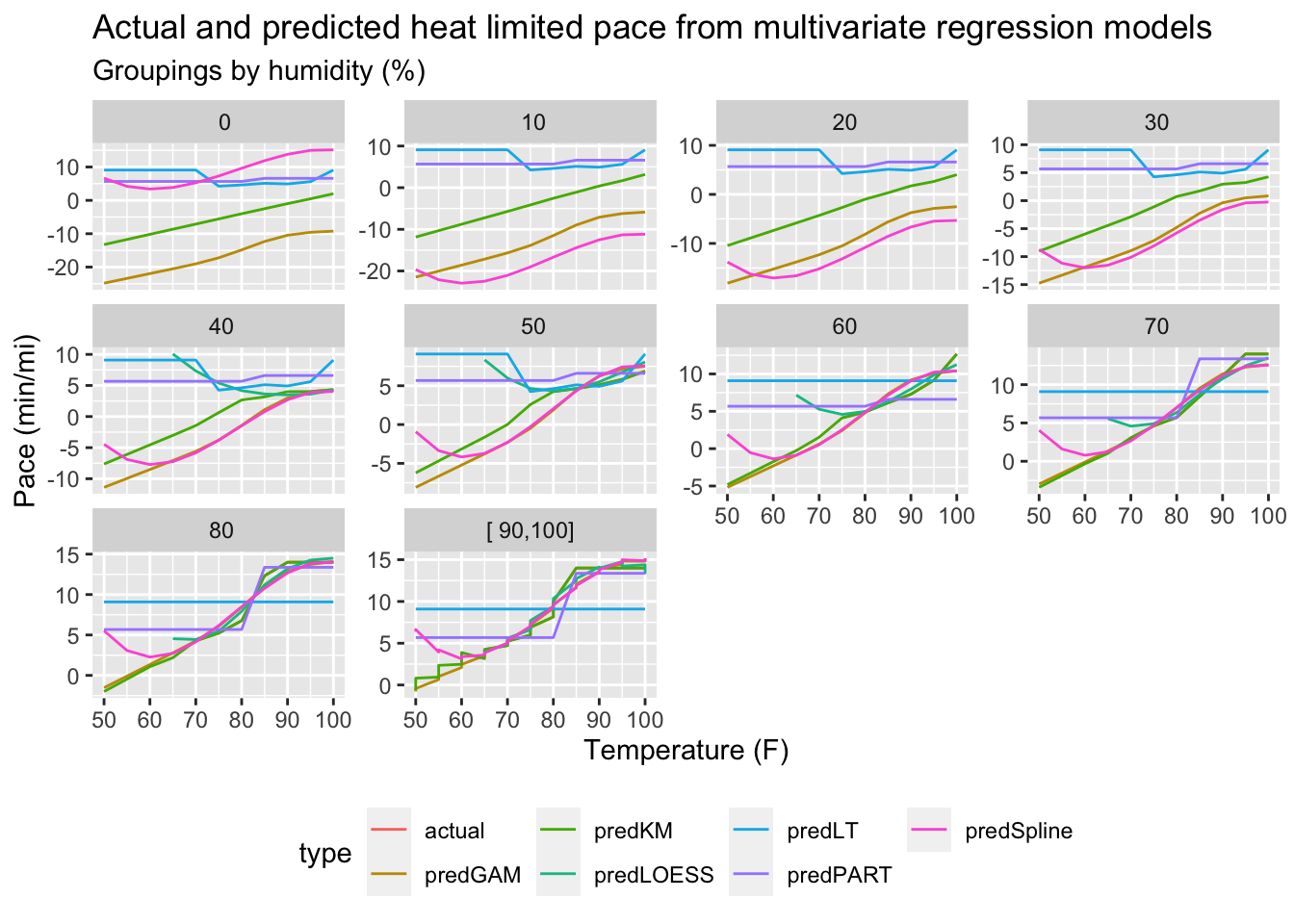
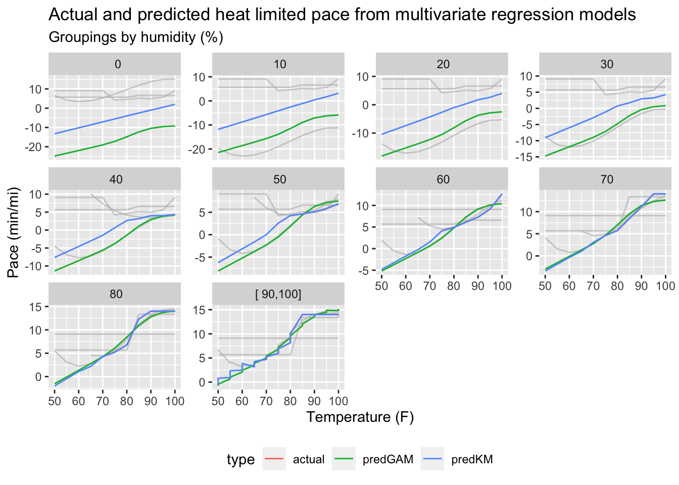
I tried out 6 different models. Here is a plot of all of those models over the domain of interest along with the actual heat limited pace data points.
This plot shows the wide range of predictive power amongst the various model types in addition to their limitations and/or strengths.
Let’s highlight a couple of models that work really well using the gghighlight package to help with the highlighting.
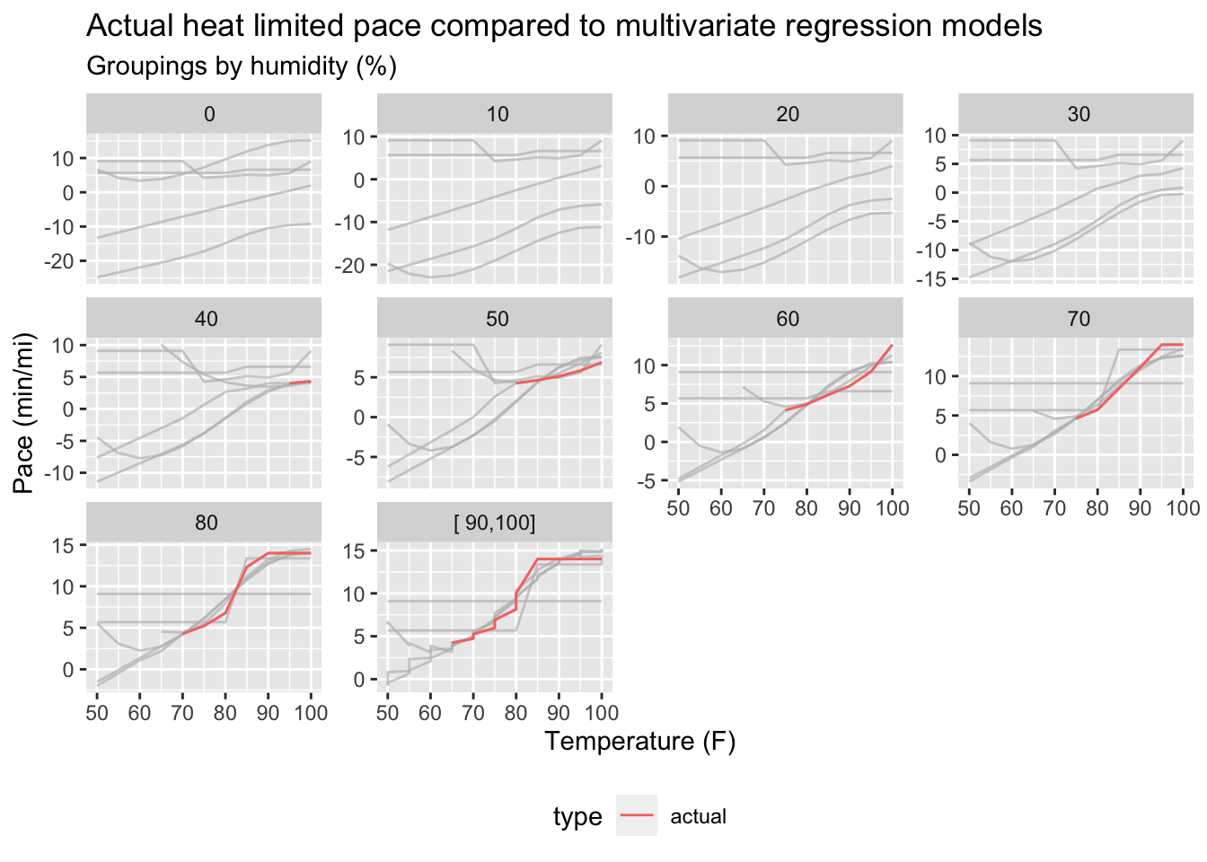
The first plot shows the actual data used to develop the regression models and the second shows the most powerful models.
I struck gold when I found a StackExchange post on fitting multivariate datasets with a recommendation to use the DiceKriging package as described in a 2009 UseR! conference presentation. This method seems to be nearly perfect with impressive predictive power given so few data points for model development.
As seen from the plots directly above, not only does the kriging model show no difference between the actual data points used to produce it,1 but it also extrapolates to lower humidities where we gave the model no data to work with!2
Now I have a validated model for use in downstream analysis that will give valid heat limited pace data for comparison against my real running data on demand!
Does the data show that extreme heat affects running performance?
If we highlight runs where average running pace was faster than the heat limited pace, we might expect a noticeable dip in running performance.
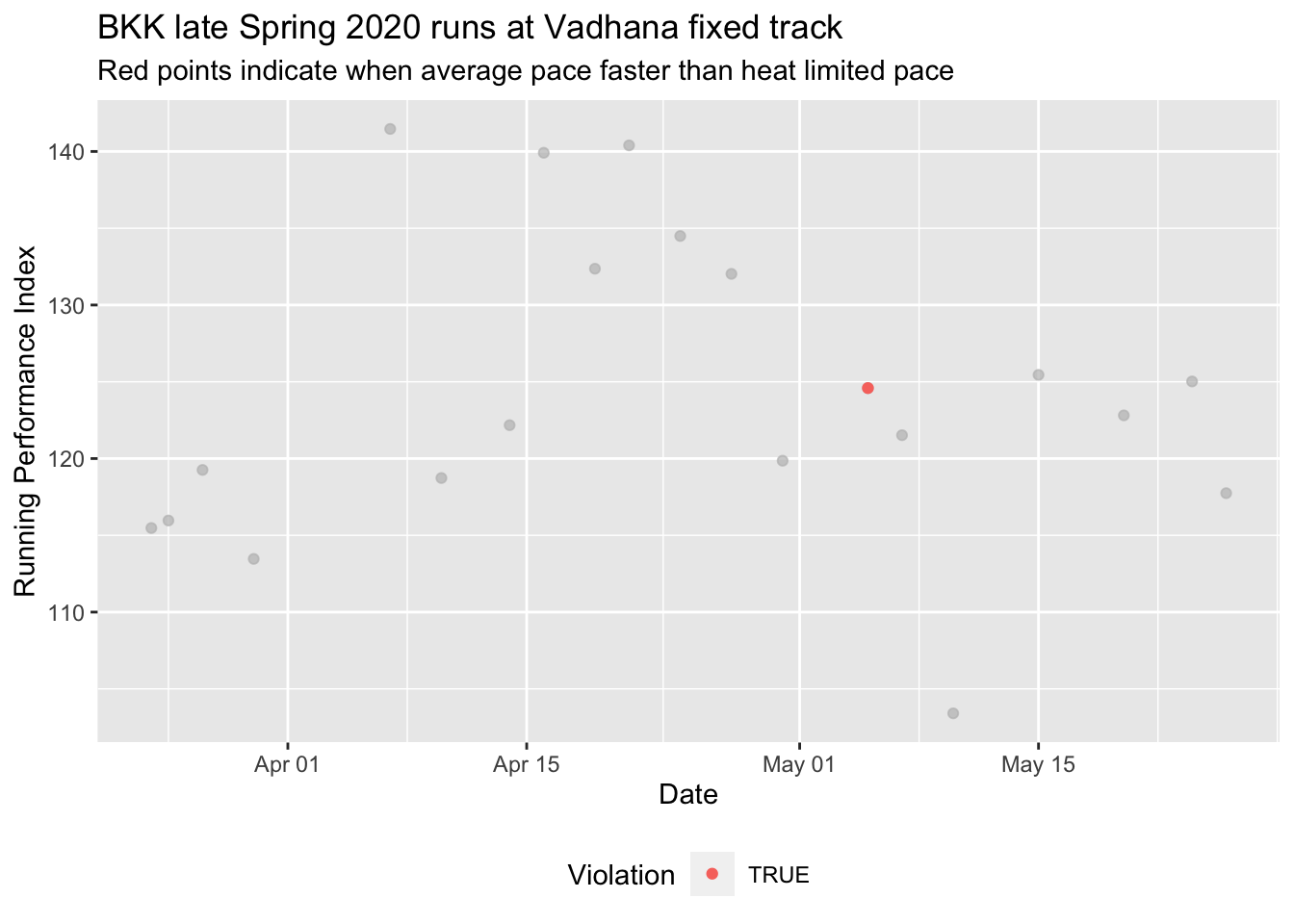
However, that’s not what we observe as the red points where the heat limited running pace was “violated” do not stand out as having significantly lower running performance than those that weren’t.
| Violation | avgRPI |
|---|---|
| FALSE | 124.2919 |
| TRUE | 124.5903 |
Interestingly, comparing average running performance between runs where heat limited pace was exceeded versus those that weren’t indicate a slight increase in performance when heat limited pace is exceeded!3
It is likely that heat limited pace really only applies for longer distances.
Now I have useful functions and workflows for future related studies.
In my next post, I will write a function using what I’ve developed to-date to plot running performance and related metrics for any run or group of runs that is time-based rather than lap-based to serve as a more flexible diagnostic tool.
You can’t see the “actual” data in the plot because it is equal to the kriging method model response so that it is completely covered by it!↩︎
WARNING: One should always be cautious when extrapolating! In this analysis, it is just for fun, and it is cool to see that the model produces some seemingly plausible extrapolated results. For serious analysis, it is best practice to ALWAYS check this against ground truth data. Do not assume a model will be correct without rigorous checking!↩︎
Although this is likely statistically insignificant.↩︎