Having recently hunkered down in Bangkok for the foreseeable future,1 in an apartment building with a closed gym,2 I wondered what kind of exercise routine I could establish.
Playing with my son in the courtyard a couple days in, I somehow got the idea of jogging a few laps around the makeshift track formed by the walking pathway – despite a heat index over 100 degrees F!
Having not run in months3, I took the opportunity to challenge myself to keep going. I forgot how running could create of flood of ideas and I suddenly thought:
“Why not try and run 100 laps!”
Using the lap function on my smart training watch, I started logging each lap as I turned the same corner over and over.
By the end of the episode I had logged 50 laps – just as I started to feel a bit dizzy and tingly from the extreme heat.
I wondered what the data would reveal about my running fitness given that I hadn’t run consistently in almost a year.
I was shocked to see that the data showed I was running a pace of about 11 minutes per mile, when I used to do similar runs (albeit in less extreme heat) comfortably between 7 and 8 minutes per mile (min/mi).
That just didn’t sound right to me so I took a look at the lap distance and noticed the very small number. Each lap was showing as about 0.06 mi. Well, it was a very small lap, so it was definitely plausible. But, based on my extensive running history, the pace that the data was showing just didn’t feel right so I decided to investigate further.
See the big red blob in the image above? That shows the inaccuracy of the GPS on my watch for this specific location (nearby a large building) and short distance.
Feeling a little defeated, I remembered that I had the Smart Tools distance tool on my phone, which allows convenient measurement of long distances from any height using simple trigonometry.4
First I measured the long side of the track with the app. Don’t mind my finger blocking the camera when I took the screen shot!
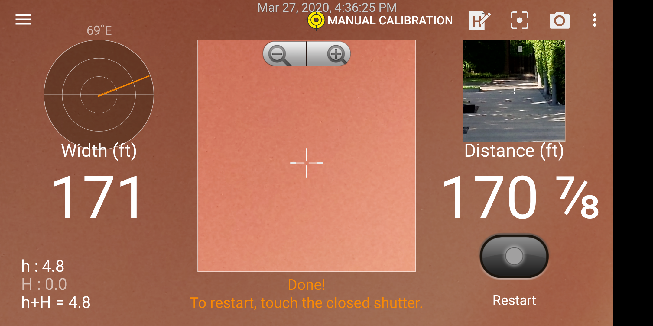
Long side of “track”.
Converting 171 feet to miles gives about 0.032 miles; with 2 sides this comes to about 0.064 miles.
And, then the short side.

Short side of “track”.
Converting 19 feet to miles gives about 0.004 miles; with 2 sides this comes to about 0.008 miles.
Adding the long and short sides yields about 0.072, which I rounded to 0.075 miles to account for what I believed to be a slight underestimate based on the start/end points I selected when measuring.
With this distance correction, my pace is closer to 8.8 min/mi instead of 11 min/mi. Now that sounds more like it!
Data prep.
Now that I got the lap distance sorted, I can take a closer look at my in-run data. The Garmin Connect website allows a lot of the data to be exported as comma separated values, or CSV format.
I organized all of the raw data in a Google Sheet.
Define function to re-format data for plotting.
# Import nice library for a variety of data manipulation and visualization.
library(tidyverse)
## Warning: package 'tibble' was built under R version 3.6.2# Basic importing, re-formatting and distance correction.
getData <- function(fname) {
day <- tbl_df(read.csv(fname, stringsAsFactors = F))
# Remove last entry, which gives summary.
day <- day %>% slice(-n():-n())
day$Laps <- as.numeric(day$Laps)
# Cool function allows splitting pace in mm:ss format
# by automatically detecting the ":" separator. This
# is to convert pace to a single plottable number.
day <- day %>% separate(Avg.Pace, c("Avg.Pace.Min", "Avg.Pace.Sec"))
day$Avg.Pace.Min <- as.numeric(day$Avg.Pace.Min)
day$Avg.Pace.Sec <- as.numeric(day$Avg.Pace.Sec)
# Re-format lap time into a single number for plotting.
day <- day %>% separate(Time, c("Time.Min", "Time.Sec"))
day$Time.Min <- as.numeric(day$Time.Min)
day$Time.Sec <- as.numeric(day$Time.Sec)
day <-
day %>%
# Distance correction.
mutate(Distance = 0.075) %>%
# Only keep data of interest.
select(Laps,
Time.Min,
Time.Sec,
Distance,
Avg.HR,
Max.HR,
Cadence = Avg.Run.Cadence,
Kcals = Calories,
Temp = Avg.Temperature,
)
}Day 1.
Now lets fix laps where I forgot to hit the “lap” button (i.e., accidentally combined splits). In this case, I only forgot one time, so the fix is pretty easy (but still annoying).
# Call data import function defined previously.
day1 <- getData("~/Downloads/Vadhana Running - 2020-03-24.csv") %>% mutate(Date = "2020-03-24")

# Split up data into 3 sections: fine-fix-fine.

# 'day1.1' is fine.
day1.1 <- day1 %>% slice(1:9)

# Split 10th lap into 2.
day1.2 <- day1 %>% slice(10)

day1.2 <-
  # Create a double entry.
  bind_rows(day1.2, day1.2) %>%
  # Divide the lap time into 2 equal times and re-assign.
  # Same for calories burned.
  mutate(Time.Sec = Time.Min * 60 / 2 + Time.Sec / 2, Time.Min = 0, Kcals = Kcals / 2)

# Lap 10 -> Lap 10 + Lap 11
day1.2$Laps[2] <- 11

# 'day1.3' is fine.
day1.3 <-
  day1 %>%
  slice(11:n()) %>%
  # Shift lap numbers by due to fixing Lap 10.
  mutate(Laps = Laps + 1)

# Recombine the sections, then fix the pace
# and convert to single plottable number.
day1 <-
  bind_rows(day1.1, day1.2, day1.3) %>%
  mutate(Avg.Pace = Time.Sec / 60 / Distance) %>%
  select(-Time.Min) %>% rename(Time = Time.Sec)

day1 %>% select(Date, everything())
## # A tibble: 50 x 10
## Date Laps Time Distance Avg.HR Max.HR Cadence Kcals Temp Avg.Pace
## <chr> <dbl> <dbl> <dbl> <int> <int> <int> <dbl> <dbl> <dbl>
## 1 2020-03-24 1 41 0.075 133 142 143 6 91.4 9.11
## 2 2020-03-24 2 43 0.075 141 143 159 8 91.4 9.56
## 3 2020-03-24 3 40 0.075 142 146 159 7 91.4 8.89
## 4 2020-03-24 4 39 0.075 147 151 161 6 91.4 8.67
## 5 2020-03-24 5 38 0.075 149 152 161 6 91.4 8.44
## 6 2020-03-24 6 37 0.075 148 151 163 6 91.4 8.22
## 7 2020-03-24 7 36 0.075 147 149 164 6 91.4 8
## 8 2020-03-24 8 37 0.075 148 151 163 6 91.4 8.22
## 9 2020-03-24 9 38 0.075 147 149 163 6 91.4 8.44
## 10 2020-03-24 10 38 0.075 156 163 163 6.5 91.4 8.44
## # … with 40 more rowsNow the data is almost ready to be plotted. But wait, there’s more! That week, I ended up trying the 100 lap challenge a couple more times. So then I thought it might be interesting to see how the data compares across the 3 runs.
Day 2.
Again, I had to fix a lap where I forgot to hit the “lap” button. The process is essentially the same, so the code below is not really commented.
day2 <- getData("~/Downloads/Vadhana Running - 2020-03-25.csv") %>% mutate(Date = "2020-03-25")

day2.1 <- day2 %>% slice(1:31)

# This time it was Lap 32!
day2.2 <- day2 %>% slice(32)

day2.2 <-
  bind_rows(day2.2, day2.2) %>%
  mutate(Time.Sec = Time.Min * 60 / 2 + Time.Sec / 2, Time.Min = 0, Kcals = Kcals / 2)

day2.2$Laps[2] <- 33

day2.3 <-
  day2 %>%
  slice(33:n()) %>%
  mutate(Laps = Laps + 1)

day2 <-
  bind_rows(day2.1, day2.2, day2.3) %>%
  mutate(Avg.Pace = Time.Sec / 60 / Distance) %>%
  select(-Time.Min) %>% rename(Time = Time.Sec)

day2 %>% select(Date, everything())
## # A tibble: 64 x 10
## Date Laps Time Distance Avg.HR Max.HR Cadence Kcals Temp Avg.Pace
## <chr> <dbl> <dbl> <dbl> <int> <int> <int> <dbl> <dbl> <dbl>
## 1 2020-03-25 1 39 0.075 126 143 144 5 89.6 8.67
## 2 2020-03-25 2 41 0.075 144 147 162 7 89.6 9.11
## 3 2020-03-25 3 39 0.075 145 149 164 7 89.6 8.67
## 4 2020-03-25 4 39 0.075 147 149 164 7 89.6 8.67
## 5 2020-03-25 5 39 0.075 147 148 163 6 89.6 8.67
## 6 2020-03-25 6 39 0.075 146 148 163 7 89.6 8.67
## 7 2020-03-25 7 39 0.075 140 147 163 7 89.6 8.67
## 8 2020-03-25 8 39 0.075 138 140 163 7 89.6 8.67
## 9 2020-03-25 9 38 0.075 139 141 164 6 89.6 8.44
## 10 2020-03-25 10 39 0.075 141 143 164 7 89.6 8.67
## # … with 54 more rowsNo lap messups fo Day 3! A much simpler data import process.
Day 3.
day3 <- getData("~/Downloads/Vadhana Running - 2020-03-27.csv") %>% mutate(Date = "2020-03-27")

day3 <-
  day3 %>%
  mutate(Avg.Pace = Time.Sec / 60 / Distance) %>%
  select(-Time.Min) %>% rename(Time = Time.Sec)

day3 %>% select(Date, everything())
## # A tibble: 50 x 10
## Date Laps Time Distance Avg.HR Max.HR Cadence Kcals Temp Avg.Pace
## <chr> <dbl> <dbl> <dbl> <int> <int> <int> <int> <dbl> <dbl>
## 1 2020-03-27 1 43 0.075 124 136 160 5 91.4 9.56
## 2 2020-03-27 2 42 0.075 138 142 162 6 93.2 9.33
## 3 2020-03-27 3 42 0.075 141 143 163 6 93.2 9.33
## 4 2020-03-27 4 42 0.075 143 147 162 7 93.2 9.33
## 5 2020-03-27 5 42 0.075 143 146 162 7 93.2 9.33
## 6 2020-03-27 6 42 0.075 146 152 162 7 93.2 9.33
## 7 2020-03-27 7 43 0.075 146 150 163 8 93.2 9.56
## 8 2020-03-27 8 40 0.075 145 147 162 7 93.2 8.89
## 9 2020-03-27 9 41 0.075 145 149 163 6 93.2 9.11
## 10 2020-03-27 10 39 0.075 144 148 164 6 93.2 8.67
## # … with 40 more rowsCalculating “Running Economy”
It is a really nice feature that Garmin Connect allows easy exporting of your run data. But, they don’t give you everything. Things that I think would be useful like humidity, wind speed, elevation (i.e., height, not gain/loss), and performance metrics like “performance condition”.
Specifically, I am interested in comparing my performance condition across the 3 runs.
I thought of a wiki about running I came across a while back that I’ve found to be very informative.5 I remembered a specific post on “running economy”, which is simply “how far and fast you can run with a given amount of energy.” I went back to take a look and a formula was given based on average heart rate, resting heart rate (RHR), lap time, and lap distance.6 Conveniently, Garmin allows export of all of these fields.7
The formula:8
Total Beats = (Average Heart Rate – Resting Heart Rate) * Time in Minutes
Work Per Mile = Total Beats / Distance in Miles
Efficiency = 1 / Work Per Mile * 100,000
With formula in hand, I added a new variable to the dataset called “RPI” for running performance index, which is meant to be a simple heuristic measure of running economy that would at least allow for comparison between runs.
# Older library allowing for "unpivoting" the data.
library(reshape2)

# Combine all days into a single dataset.
runData <- bind_rows(day1, day2, day3)

# Assign RHR.
# Based on previous 7 days read off of watch.
RHR <- 60

# Calculate RPI
# (from: https://fellrnr.com/wiki/Running_Economy).
runData <-
  runData %>%
  mutate(RPI = 1 / (((Avg.HR - RHR) * (Time / 60)) / Distance) * 100000)

runData$Date <- as.Date(runData$Date)

runData %>% select(Date, everything())
## # A tibble: 164 x 11
## Date Laps Time Distance Avg.HR Max.HR Cadence Kcals Temp Avg.Pace
## <date> <dbl> <dbl> <dbl> <int> <int> <int> <dbl> <dbl> <dbl>
## 1 2020-03-24 1 41 0.075 133 142 143 6 91.4 9.11
## 2 2020-03-24 2 43 0.075 141 143 159 8 91.4 9.56
## 3 2020-03-24 3 40 0.075 142 146 159 7 91.4 8.89
## 4 2020-03-24 4 39 0.075 147 151 161 6 91.4 8.67
## 5 2020-03-24 5 38 0.075 149 152 161 6 91.4 8.44
## 6 2020-03-24 6 37 0.075 148 151 163 6 91.4 8.22
## 7 2020-03-24 7 36 0.075 147 149 164 6 91.4 8
## 8 2020-03-24 8 37 0.075 148 151 163 6 91.4 8.22
## 9 2020-03-24 9 38 0.075 147 149 163 6 91.4 8.44
## 10 2020-03-24 10 38 0.075 156 163 163 6.5 91.4 8.44
## # … with 154 more rows, and 1 more variable: RPI <dbl>Exploratory data analysis.
In this section, I take a look at several different ways of viewing the combined dataset looking for something interesting. I start with the raw data – a look at the behavior of all unsmoothed variables as a function of lap.
# Change the data from "wide" to "long'
# to make plotting easier.
pltRunData <-
  melt(runData, id.vars = c("Date", "Laps")) %>%
  filter(variable != "Distance")

# Create a dataset of variable means
# to add to plot.
meanData <- pltRunData %>%
  # Mean data
  group_by(Date, variable) %>%
  summarize(avg = mean(value)) %>%
  # Add a column for mean value
  # plot position (y-coordinate)
  left_join(pltRunData %>% group_by(variable) %>%
  summarize(ypos = 0.95*max(value))) %>%
  filter(variable != "Distance")

ggplot(pltRunData, aes(x=Laps, y=value)) +
  geom_hline(data=meanData, aes(yintercept = avg), colour="red", lty=3) +
  geom_text(data=meanData,
            aes(label=round(avg,1), x=62, y=ypos),
            colour="red",
            hjust=1,
            size=3) +
  xlim(c(1,65)) +
  geom_line() +
facet_grid(variable ~ Date, scales = "free_y") 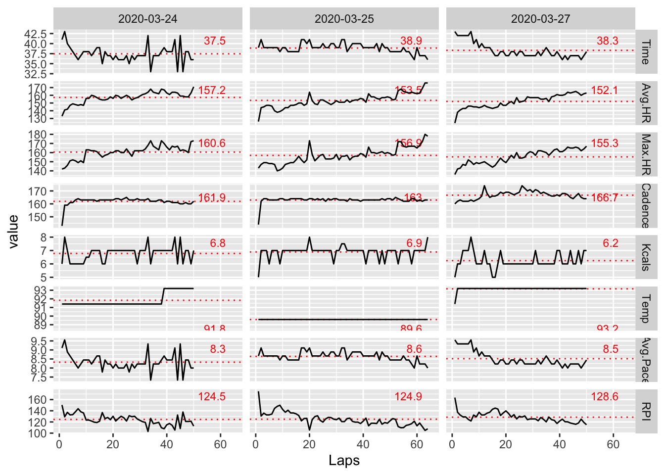
Let’s get rid of the less interesting variables.
lessPlt <- pltRunData %>% filter(variable == "Avg.HR" |
                                 variable == "Avg.Pace" |
                                 variable == "Cadence" |
                                 variable == "Temp" |
                                 variable == "RPI"
                                )

lessMean <- meanData %>% filter(variable == "Avg.HR" |
                                variable == "Avg.Pace" |
                                variable == "Cadence" |
                                variable == "Temp" |
                                variable == "RPI"
                               )

ggplot(lessPlt, aes(x=Laps, y=value)) +
  geom_hline(data=lessMean, aes(yintercept = avg), colour="red", lty=3) +
  geom_text(data=lessMean,
            aes(label=round(avg,1), x=62, y=ypos),
            colour="red",
            hjust=1,
            size=3) +
  xlim(c(1,65)) +
  geom_line() +
facet_grid(variable ~ Date, scales = "free_y") 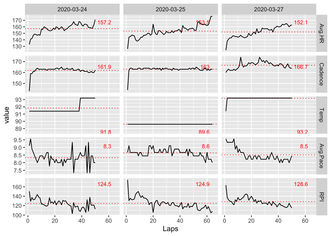
Now, we are left with a core set of interesting information. In particular, looking at RPI, it looks like Day 3 shows the highest efficiency on average. This matches how I remember feeling that day as I felt I could have kept going for quite a bit more before I really started to overheat.
The average cadence for Day 3 is also noticeably higher on average than the other days. This is not surprising because higher cadences are known to correlate with higher performance. My average pace also dropped steadily from the beginning to the end of the run on Day 3. Again, this is likely attributable to the increasing cadence over the same period.
It is also interesting to note that my average heart rate was the lowest on Day 3 across all days. Compared to Day 1 where it was the highest, I also had the fastest pace. So, the tradeoff between speed and endurance is clearly seen in the data and I can attest it was definitely felt!
The data also shows that the temperature on Day 2 was a bit lower than the other days, and I remember noting to myself on Day 2 that it felt significantly cooler than Day 1. I imagine this was the reason I was able to run 64 laps before starting to feel fatigued.
Now including each day’s data on the same plot is tried for easier comparison.
lessPlt$Date <- as.factor(lessPlt$Date)

ggplot(lessPlt, aes(x=Laps, y=value, color=Date)) +
  xlim(c(1,65)) +
  geom_line() +
facet_grid(variable ~ ., scales = "free_y") 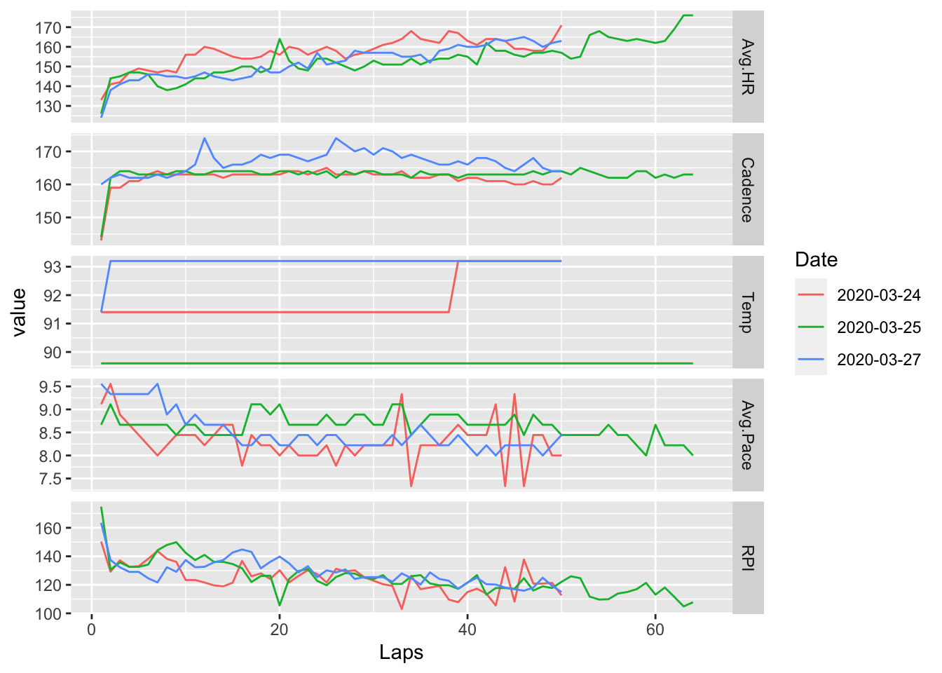
However, I don’t like that the legend is needed to figure out the corresponding day. The viewer has to constantly flip back and forth between the plot and the legend and makes it cumbersome to interpret as opposed to the preceding plot, which is organized chronologically on the x-axis and can be read more naturally allowing for quicker/easier comparisons; also, adding the mean values provides an additional useful reference when comparing similar trends across days.
Another view is tried looking at only mean data across days.
dayData <- meanData %>% filter(variable != "Max.HR", variable != "Time", variable != "Kcals")

ggplot(dayData, aes(avg, fill=variable)) +
  geom_bar() +
  facet_grid(Date ~ variable, scales = "free") +
  theme(legend.position="none")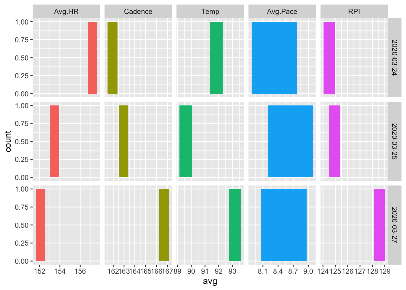
A relationship between cadence and RPI, cadence and pace, and heart rate and temperature can be easily seen.
The mean data with a scatterplot.
ggplot(dayData, aes(Date, avg, color = variable)) +
  geom_point() +
  facet_grid(variable ~ ., scales = "free") +
  theme(legend.position="none")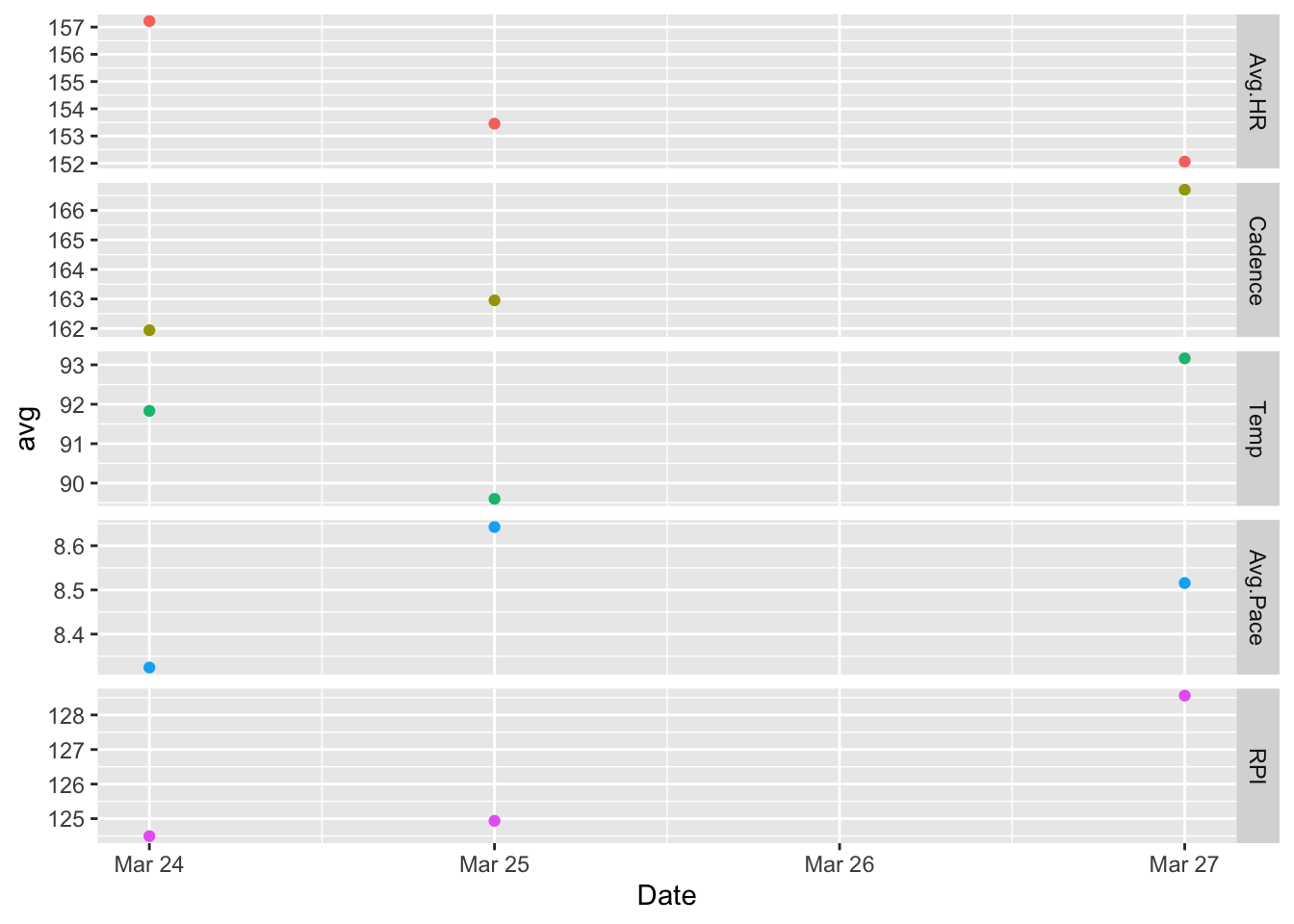
The above plot is sparse and hard to interpret, so I changed it to a line graph. Note the absence of a point for ‘Mar 26’ indicating that data is being interpolated at this point – this is too subtle for my liking.
ggplot(dayData, aes(Date, avg, color = variable)) +
  geom_point() +
  facet_grid(variable ~ ., scales = "free") +
  geom_smooth() +
  theme(legend.position="none")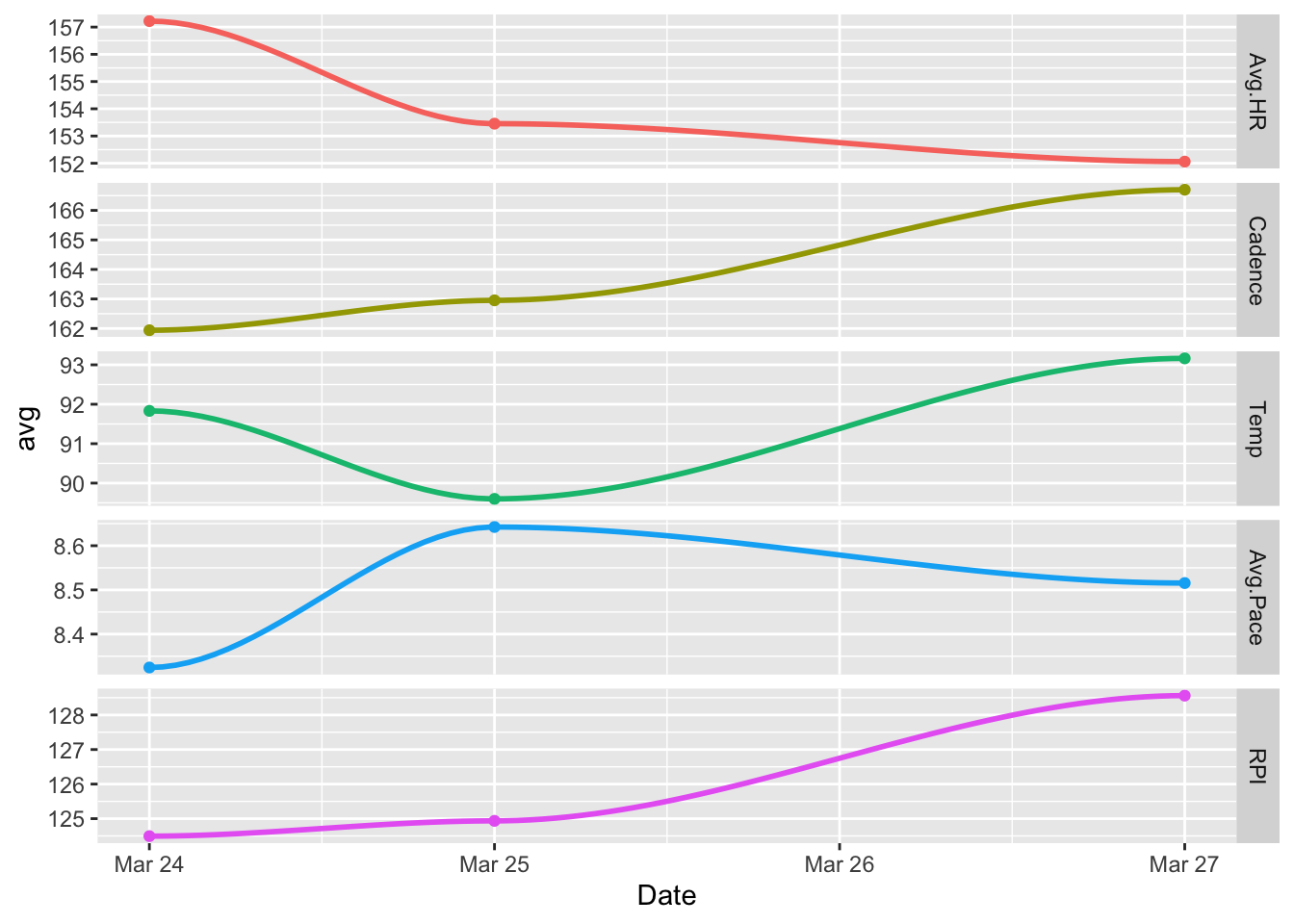
It’s changed back to scatterplot, but this time with a line of best fit, or regression line, added.
ggplot(dayData, aes(Date, avg, color = variable)) +
  geom_point() +
  facet_grid(variable ~ ., scales = "free") +
  geom_smooth(method = lm, se = TRUE) +
  theme(legend.position="none")
## `geom_smooth()` using formula 'y ~ x'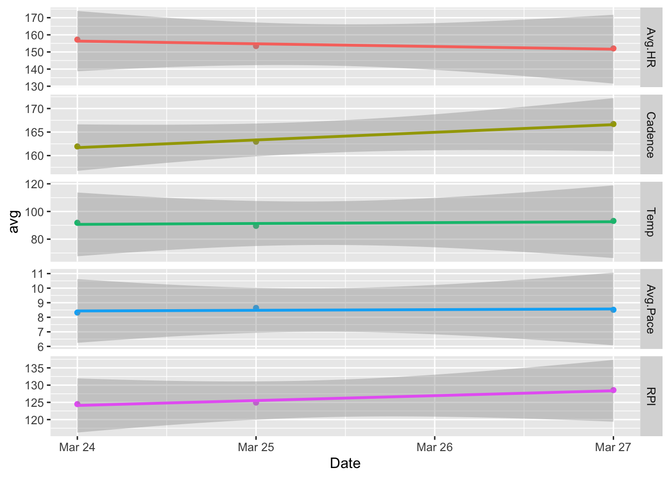
The error bands added by default don’t add much value so they are removed leaving the final version based on mean data below.
The following plot and the one above of the reduced set of unsmoothed variables as a function of lap are the most interesting to me as they allow for a clear visual of several trends and easy comparisons between them.
ggplot(dayData, aes(Date, avg, color = variable)) +
  geom_point() +
  facet_grid(variable ~ ., scales = "free") +
  geom_smooth(method = lm, se = FALSE) +
  theme(legend.position="none")
## `geom_smooth()` using formula 'y ~ x'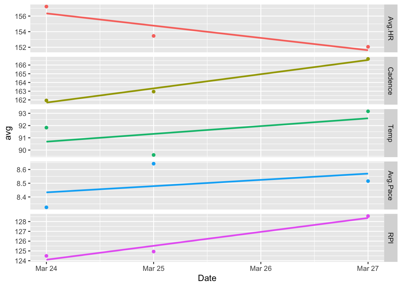
So, in short, on an extremely hot day in Bankok, slow down, and increase the cadence. When this happens, average heart rate decreases, you can delay the onset of fatigue, and run longer!
I’m still set on completing 100 laps without stopping before I leave this place. Hopefully, I will take my own advice when I try again tomorrow.
Thanks, again!↩
And not consistently in almost a year.↩
All that is needed is a right triangle with one side known (phone height) and one other angle.↩
I found the site looking through the description notes of the OneRunData data field available for my running watch.↩
It was also nice to see the site reference a scientific study that came up with essentially the same formula (see DOI 10.3389/fpsyg.2019.03026).↩
Except RHR, but this can be easily estimated.↩
Formula as-listed on https://fellrnr.com/wiki/Running_Economy.↩